Right Story Group is a communications consultancy in Chicago, with a small team of experts who help companies fine-tune their messaging to navigate all sorts of events and crises. When they came to me, however, it quickly became clear that their site didn’t communicate this to potential visitors very well – not only based on their extremely dated design, but also a confusing layout for users with especially dense information to absorb. It had the rough elements to explain the Right Story Group brand if users spent enough time with the site, but their presentation was scattered and hard to follow.
Goal-setting
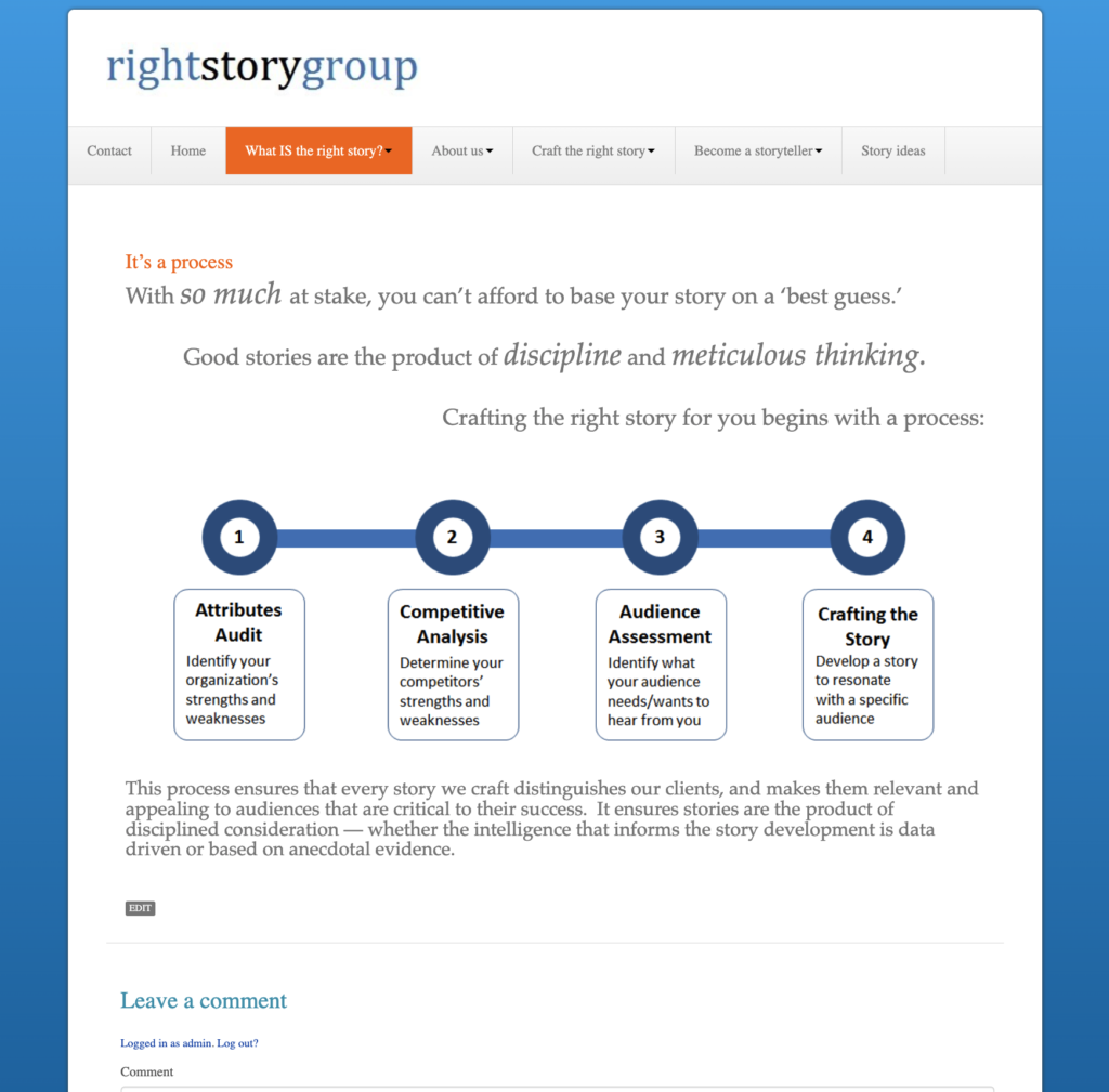
Above is an example page of the old RSG site (here, preserved by RSG’s request at the time) – a lot of the problems with the site are evident.
- The plain layout doesn’t prioritize/give hierarchy to information well, and the design in general looks very dated
- The font treatment below the page header changing size, emphasis and alignment in an unorganized way make it hard to read for no real reason
- The graphic doesn’t add much to the story – it’s so basic and standard a process that it doesn’t really bear displaying
- The comments section is left activated – a relic of early WordPress deployments that doesn’t need to happen on a professional site that doesn’t invite discussion in its content
- The navigation menu is broken out into into somewhat confusing headlines – and each of these have a few flyout items beneath them as well. The pretty standard navigation menu of “Who We Are”, “What We Do”, “Our Work” that users would expect to see in a site like this is lost in too many separate pages and trying to rename these sections when they don’t need to be. Visitors won’t know where to go to find what they’re looking for. “Story Ideas” is also a dead blog section.
- Also, many of the separate pages under the nav are very similar to this one – a few sentences, perhaps a graphic, and that’s it. There’s no need to segment out the content to this degree.
The final and biggest problem that stood out to me as I read over all the pages of the site was one with the messaging. The offerings of Right Story Group were presented as, fittingly, “right stories” – “the right story in a crisis”, “the right story for investors”, “the right story for you”. But looking at the site from the outside, the copy said what right stories do, had examples of right stories, offered guidance of how to tell right stories… but never actually laid plain what a right story actually IS. The page even labeled “What is a right story” described it as a process. Site visitors could eventually infer what was meant if they read enough, but it needed to be less opaque.
Given these problems, I talked with the owner, Jim, about what his goals were for the site. Jim wanted to keep what elements worked, updating content while avoiding rewriting EVERY element – but rearrange them to be more effective and present them in a more appealing way. The goal was to make the site simpler to absorb, and thus more effective at delivering the company’s story and message.
Research and ideation
With that in mind, research was needed to give some idea of where to start. As a small site, there wasn’t budget for in-depth research with other users and their opinions of the site’s user experience, so we resorted to reviewing WordPress themes on themeforest.net for layouts and features that would support all of the information we needed in a more modern format.
A lot of WordPress designs can blend together, so we wanted something that had a good visual impact – and for my own part, I wanted a theme with lots of options for content layout (tabs, toggles, portfolios, lightboxes – all responsive and cleanly designed). Themes that had all the options were then reviewed further to compare HOW the elements functioned – speed, padding/margins, responsiveness, and so on.
There are many themes “designed” with certain professions in mind, consultants included – but at this stage all looks are on the table. The focus is not on what the theme designers had in mind when they put their theme together, but what can be envisioned from the theme based on how everything works together.
After a few rounds of review, we settled on RED:FOLIO, a theme with everything we needed.
Thoughts behind the new design
RED:FOLIO is a one-page theme – with the old site having so many pages on which to chase down each bit of content, it made much more sense to make all of it available from a single location.
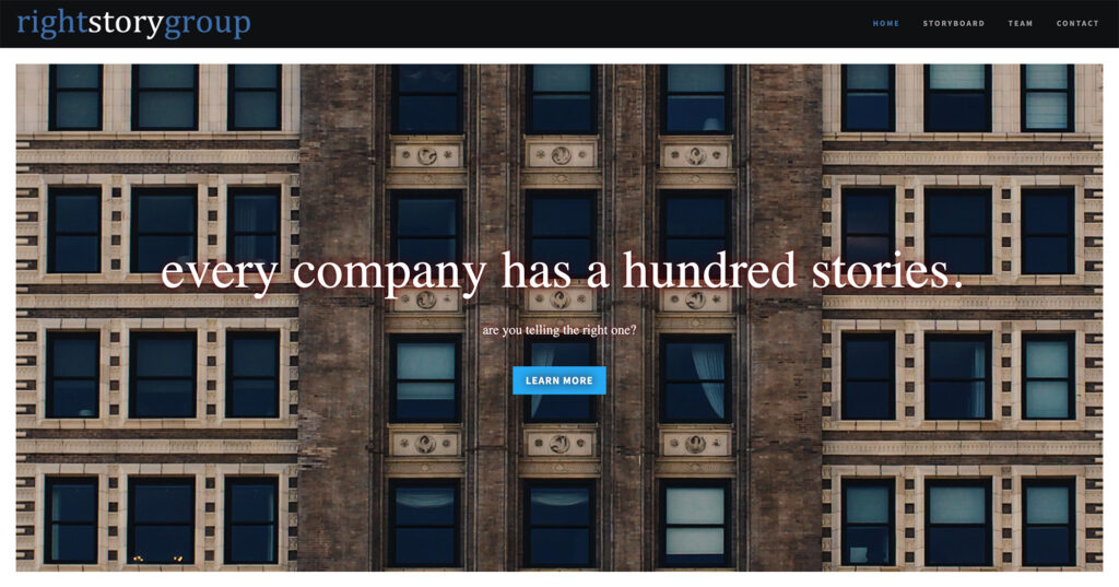
The first priority was a much simpler navigation. In the new nav, there are no flyouts or sub-menu items hiding more options – the heavily-pared down menu is very plain for visitors:
- Home is self-explanatory
- Storyboard moves them further down the page to the “meat” of the content (see below – visitors may not recognize the option by its name immediately, but in a one-page site the answer comes quickly)
- Team is also self-explanatory; this links to a separate page
- Contact is again self-explanatory; this moves to the bottom of the page
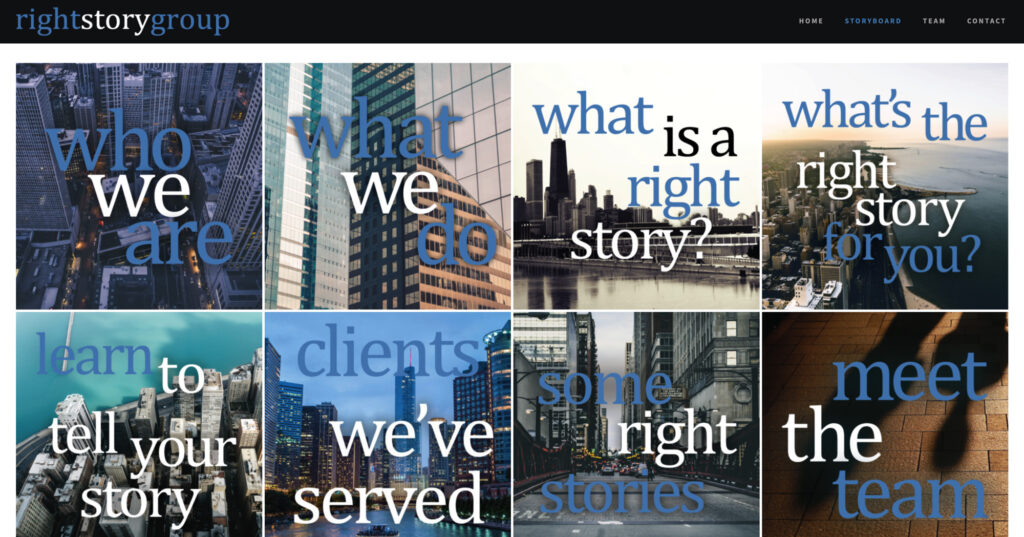
The Storyboard section of the site hosts the main content areas carried over from the old site. It’s much more graphic (standing out more on mobile – the boxes adjust responsively to window size). The last two boxes link to new pages (the “meet the team” box links to the same page as that in the nav menu), but when clicked, the other boxes pop up in lightboxes as below:
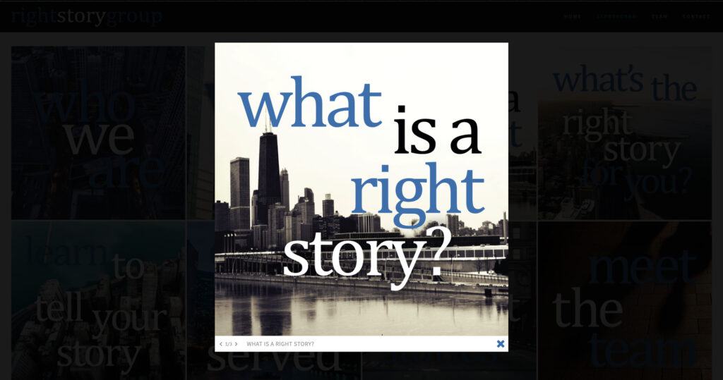
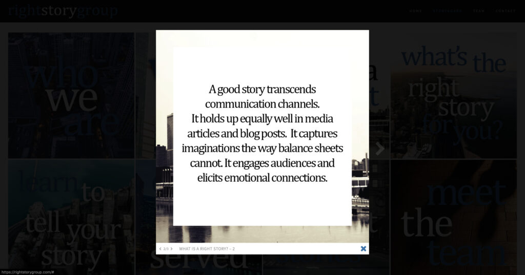
Due to the earlier background work reviewing themes for their features and functionality of those features, these lightboxes have several navigation options – they can be clicked through using the small arrows in the bottom bar of each image, using the faint arrows to the left and right of each image, or using the left and right arrows on the keyboard. I was able to use code to hide the “secondary” slides tied to each pop-up, so that only the first slide displays in the grid and the following slides are reached by left-right navigation.
Now, almost all the information of the previous site can be accessed on one page, preventing users from having to drill down through an unnecessarily complicated nav menu to reach RSG’s content and understand their offerings.
Results
Jim was very pleased with the new, more graphic look to the site and the greatly simplified navigation. The imagery (stock of Chicago) gives more personality to the RSG brand, but doesn’t distract from the information presented on the pop-ups and linked pages. The new information architecture makes it much simpler for visitors to quickly understand what RSG can offer
Room for future improvement
As a web designer with a solid grasp of working with “design” code (HTML/CSS) but only limited ability to work with “function” code (Javascript/PHP), there are still elements of this design I’d like to see improved – the main focus being on the pop-up content boxes.
The biggest thing I’d like to add is a simple UX improvement for BOTH the desktop and mobile versions – a brief semitransparent pop-up that explains how to navigate left and right through the “slides” of each pop-up. It could fade after a few seconds, or fade on click (on the popup itself or the navigation arrows) – the left-right navigation is intuitive for those already familiar with these types of popups, but may be less immediately apparent to other visitors.
Aside from that, I’d want to add swipe functionality to the pop-ups for mobile – because while they have room to the left and right on desktop for arrows, on mobile’s vertical format they don’t, so they can only be “turned” to the next slide with the small arrows at the bottom of the image.